Extract data from datasheet sensitivity graphs and use it to estimate ppm of a gas depending on MQ sensor resistance
I tried to connect some of the gas sensor modules I have bought over time to Arduino. Unfortunately, I discovered these modules were not designed properly and require some modifications in order to power sensors according to datasheet specifications. I am using an MQ-2 type sensor for this test and all of the following estimations will be specific for this type of sensor. You can use the same approach to read and process analog input of any of the other sensors from MQ family.
You won't find in any of the available datasheets a direct, clear formula to approximate ppm of a gas based on the sensor resistance. But there are some sensitivity graphs which we can use to find a correlation. To make things even more complicated, for MQ-2 there are two datasheets available, from different manufacturers, with different sensitivity data.
Quick overview
MQ sensors are semiconductor gas detecting devices, which use tin dioxide (SnO2) placed on a ceramic base with a nichrome heater inside. When heated to 300-400 degrees Celsius, the resistance of tin dioxide is increased by oxygen and decreased by various gases. This kind of sensors have some disadvantages, such as low specificity, high power demand, frequent calibration need and short lifetime. However, they are cheap, easy to find and have good sensitivity to a wide range of dangerous gases.
In the table above I extracted datasheet data, since there are two manufacturers of these sensors, and sensitivity measurements are made a bit different. Hanwei tested all of their sensors in a known concentration of gas (even temperature and humidity variation is measured in the same gas). On the other hand, Winsen reports all sensitivity tests relative to sensor resistance in clean air. But when they testes environment influence (temperature and humidity) they placed the sensor in a known gas concentration.
With low specificity, an MQ sensor isn't quite designed to measure the ppm of a gas. Instead it should be used to detect the presence of dangerous gases and take appropriate actions. To put it simply, by looking at a sensitivity graph, just get the lowest drop in sensor resistance to the lowest concentration of gas. You can use that as a reference to trigger an alarm. Anyway, I will attempt some ppm estimations in this post, using MQ-2 sensor exposed to isopropyl alcohol (although I believe they used ethanol in the measurements).
Sensitivity graphs
The graphs in datasheet are log-log plots describing the relation between sensor resistance and concentration of various gases. I will use WebPlotDigitizer to extract data from graphs. Since I do not have the possibility of exposing the sensor to a known gas concentration to calibrate it, further calculations will be made relative to sensor resistance in clean air.
Here is how you do it. Extract the image of a sensitivity graph from datasheet. Winsen has them embedded in PDF as raster images with a low resolution. Try to get them as they are (i.e. click the graph image, right click and select Copy in Adobe Acrobat, the paste in Paint and save without resizing). Hanwei datasheets contain vector graphics. This means you can render the graphs at any resolution you want. I loaded the PDF in GIMP, selected page 2 (with graphs) then used 600 DPI resolution to rasterize it, cropped the resulted image to keep only the graph and saved as PNG.
Winsen or Hanwei? That's up to you. Unfortunately results are not consistent. By looking at some of the PDF datasheets I found, the unmodified ones from Hanwei are since 2007-2008. This makes me think the sensors available nowadays on the market are manufactured by Winsen, since their datasheets are newer.
Download or use the web version of WebPlotDigitizer for the next step. I will start with MQ-2 sensitivity graph from Winsen, which is an image of 400 by 305 pixels. Use File - Load Image(s) to open it. Select plot type as 2D (X-Y) Plot and click Align Axes. Then it will tell you how to map points on X and Y axis. Do your best, since these points are used as reference in computing coordinates of points you will place later on the graph. Click Proceed.
Use your mouse and place a point on X axis at a known position, to the left as much as possible. Click in the approximate location then, without moving the mouse, use arrow keys to properly position the point.
 |
| Points alignment in WebPlotDigitizer |
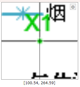
This is how a properly aligned point should look. Note it is in the middle of the axis, X being the horizontal one, while the vertical is the grid for 200 ppm. Repeat and add a second point on the X axis, to the right. Then do the same for Y (add two points, one at a low value, the other at a high value). Click Complete when done. Don't worry, these points may be adjusted later.
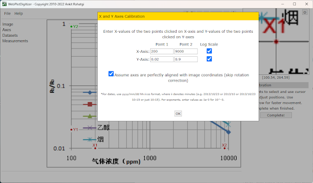
Next, you must tell this software where exactly you placed those points. The image does not require rotation correction (this would be useful for scanned documents) and the scale is logarithmic.
 |
| Set axis in WebPlotDigitizer |
This is how my point look and their corresponding values. Click OK at this step. The graph is mapped and opened. In the left pane there is Datasets menu. You can choose to rename default dataset to Alcohol, Smoke, Methane or Propane for example and change its color as you wish.
It is time to start placing points on the sensitivity line corresponding to a gas. It is not required to place those points in the same locations where the existing ones are. From the graph, we can see they did measurements at 300, 1000, 5000 and 10000 ppm. Choose a gas. All the points you place must be on its line, but not over the existing ones. There are two way to get the relation between ppm and Rs/Ro.
The mathematician's way
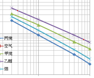
Choose two point on the line of the gas you're interested in. For increased accuracy, make sure they are close to the ends. Here are my points on the alcohol line:
 |
| Selected points on the line of a gas |
In the left pane there is View Data button. I can click it and find what I'm interested in. This the data:
- 390.10872292268755; 0.37796709955601276
- 7645.229810794611; 0.07348737980263367
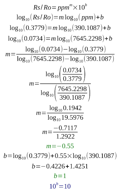
First is ppm, then Rs/Ro. At 390 ppm, Rs/Ro is about 0.3779. These log graphs show a straight line, which indicates the equation: Rs/Ro = ppmm * 10b. The unknown constants m and b are the slope (exponent) and the intercept (scale factor) and can be computed.
I won't go into details regarding these calculations. Knowing m and b, we can estimate ppm:
This won't be easy to compute for an 8-bit microcontroller like the ATmega328. If you're still reading this, here comes the more efficient way of finding the equation.
Re-plotting the graph
I am going to load the datasheet extracted images of graphs in WebPlotDigitizer and get the coordinates of all points (for all gases). This time I am going to place my points exactly over the existing ones, because I am plotting multiple datasets (gases). Then, using spreadsheet software such as LibreOffice Calc or Microsoft Excel, I will get ppm equations in a few clicks. After loading the image and mapping X and Y axis, I can use datasets and add points over the existing ones one the graph. Here are the points for alcohol:
- 300.7183348050943; 0.4353523471955892
- 1002.5704193770591; 0.22878349531396555
- 5006.25337480793; 0.09422562390355069
- 9995.170369490443; 0.06256892782007331
These can be copied in LibreOffice Calc. If you want to plot multiple gases, make sure the points you place are at the same X value for each of the gases (in other words, the ppm at which you extract Rs/Ro should be the same). Let me show you the points for methane, to see what I mean:
- 300.7183348050943; 0.31406244049258697
- 1002.5704193770591; 0.16829335144965854
- 5006.25337480793; 0.06474052825098695
- 9995.170369490443; 0.043623077236748256
This is how you paste data in spreadsheet:
 |
| Extracted data from graph |
With this data selected (without the top row, the one with Rs/Ro when...), I inserted XY Scatter chart. Default options are good enough (Data series in columns, with first row as label). Double click in the graph area, then right click a point and choose Insert Trend Line. This is where the magic happens. Choose Power Regression, give it a name (optional) and check to show equation. Set X and Y names accordingly. Do this for a point of each gas.
 |
| Insert Trend Line in LibreOffice |
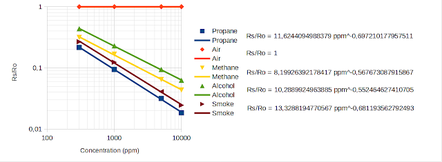
With a bit of formatting (right click axis to set them to logarithmic and add major and minor grid, move equations away), I got this:
 |
| MQ-2 Sensitivity with Regression Equations, based on Winsen data |
Some would say all I did was to re-plot an existing graph. I could have done that using a line chart type, which would just plot the points on XY axis and join them by lines. This would create exactly the same graph as in datasheet.
But, if you look carefully, you will see the legend of my graph has a point and a line for each gas. The point is extracted from datasheet. The line is the plot of the computed equation. Points do not fall perfectly on the line (there is R2 coefficient which you can choose to display; as long as it is not exactly 1, it means points are very close, but not exactly on the line). If you're curious, feel free compute Rs/Ro for the ppm values selected above. It will not be exactly the same.
Conclusion
Back to the practical points. I can't believe LibreOffice is not letting me copy that equation. I had to write it myself:
Rs/Ro = 10.2889924963885 ppm^-0.552464627410705
There is clearly more precision here if we compared to what I calculated. Even slight changes in exponent affect the output. Let's put this into code, knowing that 10^b = 10.2889924963885 and m = -0.552464627410705.
const float Ro = 14248.0; // presumed sensor resistance in clean air
const float slopeAlcohol = -0.552464627410705;
const float scaleAlcohol = 10.2889924963885;

double ppm = 0;

ppm = pow(Rs / (Ro * scaleAlcohol), 1 / slopeAlcohol);
Serial.print("ppm:");
Serial.println(ppm, 0);
Keep the sensor in clean air and use its resistance as Ro.
A different approach
So far, I re-created datasheet sensitivity graph and found the equations to compute Rs/Ro based on ppm. But why not find the equation to compute ppm based on Rs/Ro. Let's take a single gas and switch data columns (put Rs/Ro on X and ppm on Y).
 |
| Transposed sensitivity data |
Following the same steps, I add a chart and find the equation.
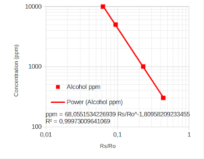 |
| Plot with ppm on Y axis |
This is then used in code:
ppm = 68.0551534226939 * pow (Rs/Ro, -1.80958209233455);
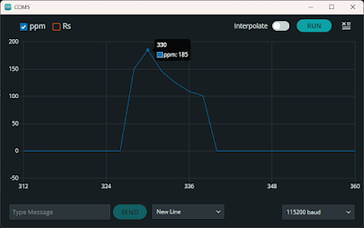
Nevertheless the result is the same. Note that you should include some validation of ppm in the code. Even when Rs = Ro, computed ppm is 68. According to Winsen datasheet, ppm less than 300 is not detectable. These calculations should not be considered reliable in applications where safety matters. In the next post I will take into account temperature and humidity variations.
References
- Zhengzhou Winsen Electronics Technology Co., Ltd. (datasheets)
- Hanwei Electronics Group Corporation (datasheets)
- MQ gas sensor correlation function estimation by datasheet by Davide Gironi.





No comments :
Post a Comment
Please read the comments policy before publishing your comment.